Meteorologists Urged To Stop Giving 100%
I recently finished spending a year collecting and comparing forecasts from four different providers for seven different locations across the US.
Background #
Why Did I Do It? #
The petty rage of a first world problem. My phone said there was a 0% chance of rain today, but it rained. More than once. This made me curious about what the forecast data actually looked like, and how different provider predictions compare.
Daily Information Analyzed #
- Low temp
- High temp
- Probability of Precipitation (POP). e.g. 70% chance of rain, or 30% chance of snow
The Forecast Providers #
I wanted to collect forecasts from all the providers I could find. My requirements were:
- Must have a free API tier. This ruled out providers like World Weather Online and Weatherbug.
- Must provide a numeric probability of precipitation, not just subjective info like "partly cloudy, chance of rain". This ruled out providers like OpenWeatherMap, Yahoo, and Accuweather.
Given those requirements, I ended up with four: Aeris, Dark Sky, NOAA, and Weather Underground.
The Locations #
I used a limited set of locations, with the following goals: I wanted a broad range of weather forecasting difficulty. e.g. On one end of the scale was San Diego, which is known to have some of the most stable and predictable weather. I also wanted the opposite of that, and according to fivethirtyeight, Houghton Michigan is the least predictable for precipitation.
I wanted the locations to be as specific as possible.
Providers will give forecasts for a city, which can be misleading for geographically large cities. The most consistent and comparable location I could think of
was airport. Some providers like Wunderground accept an airport code like MSP. The others didn't support airport code, but do support lat/long, so I used that for the rest.
Given those goals, I chose these seven airports:
- SAN (San Diego International, California)
- JFK (John F. Kennedy International, New York)
- ORD (O'Hare International, Illinois)
- CMX (Houghton County Memorial, Michigan)
- MSP (Minneapolis/St. Paul International, Minnesota)
- DEN (Denver International, Colorado)
- SFO (San Francisco International, California)
The Collection Process #
I built a client that would use the API of each provider, scheduled to collect for all the locations each morning at the same time. I collected as many days in advance as the provider would give. They all gave predictions from 0 to 3 days out, so 3 days out is the farthest any of my comparisons go.
The date range of the data is thirteen months worth of data: from August 1 2016 through August 31 2017. There were almost 70,000 rows of data. There were a relatively small number of errors total that resulted in missing data. e.g. There were a few times where the client was throttled or got some bad JSON, and a few daily observations were missing data. So the data's not perfect, but seems good enough to make some aggregate observations. I was pleasantly surprised by the stability of all the services though. Also kudos to Digital Ocean for 100% uptime for over a year on a $5/month virtual private server.
If you look at the code, you'll see Dark Sky's data labeled as forecast.io - they changed their name midway through my collection process, but I kept the old name to be consistent.
Don't Bore Us, Get To The Chorus #
These were the questions I found most interesting to answer...
You Said It Wouldn't Rain Today! #
This chart shows a count of the number of times providers predicted a 0% probability of precipitation today,
when in fact there was at least 0.1 inches of precipitation. Lower is better.
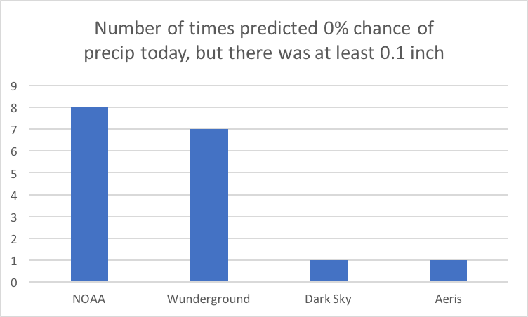
This is the most lenient way to view this scenario. NOAA and Weather Underground had the highest count at 8 and 7 respectfully.
Aeris and Dark Sky had it happen one time each. This should never happen. It looks much worse if you count any precipitation.
But Dan, A zero percent chance of rain doesn't guarantee dry conditions; it just indicates that, based on available information, rain is highly unlikely.
I think this is bullshit. If you're going to give a 0% chance of rain forecast, there should actually be a 0% chance of rain. If rain is extremely unlikely, then don't give a 0% chance of rain. Give a 1% chance of rain, or a 5% chance of rain. Never 0%.
Where did these errors happen? #
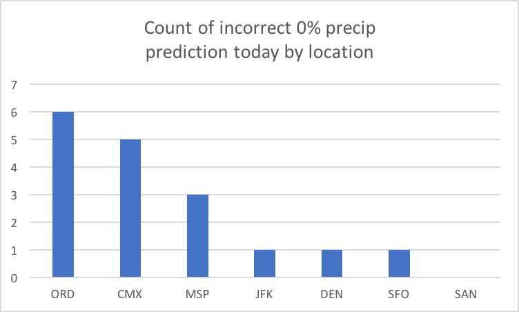
Turns out O'Hare was even more difficult to predict than Houghton for this date range. San Diego's not even on the board.
This confirms you can achieve a great work/life balance in San Diego as a forecaster.
You Were Sure It Wouldn't Rain Three Days Ago? #
If you include predictions from three or less days out, you end up with these counts by provider.
Again, this is forecasting a 0% chance of precipitation, when it reality there was at least 1/10th an inch of precip.
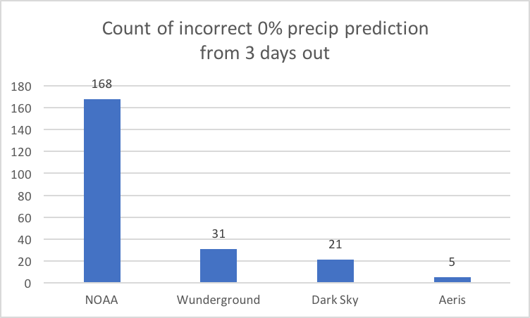
NOAA's data is pretty bad for this span - I'm not sure what's going on. The lesson here is don't rely on NOAA's API data for long-range precipitation predictions.
You Were Sure It Would Rain! #
Not nearly as serious a cloud crime since you hopefully brought your rain jacket, but still something that should never happen...
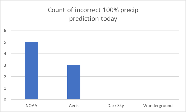
Above is the count by provider of those that predicted a 100% chance of precipitation today, when in reality there was none.
Nailed It! #
Enough complaining. Let's talk about those providers that totally nailed it for various situations.
Perfect no-precipitation prediction today #
Here's a chart showing the count by provider for correctly predicting a 0% chance of precipitation today:
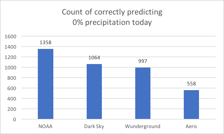
Often the sunny skies optimist, NOAA unsurprisingly is correct the most often at predicting no precipitation.
Rain Long-Shots #
Here's a chart showing the count by provider for correctly being 100% sure about it raining 3 days out:
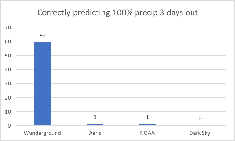
This was interesting to me - Wunderground is 100% sure about precipitation from 3 days out quite a bit, and they weren't ever wrong about that.
(Again using 1/10th of an inch as the threshold of substantial precipitation.) They get the bold award.
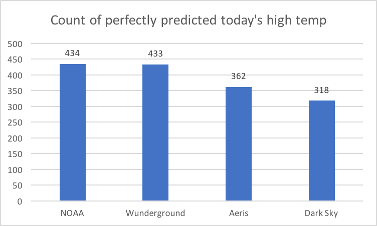
Nailing today's lows #
A count by provider correctly predicting today's low temp
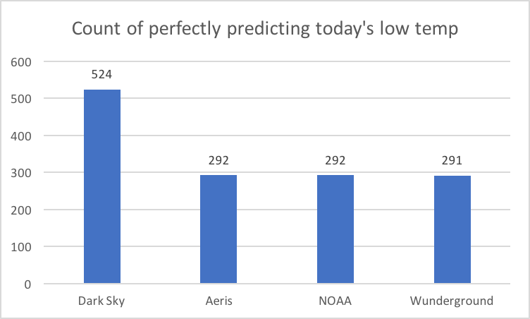
Also interesting to me - Dark Sky has almost twice the count compared to the other providers in predicting today's low temperature.
Nailing today's lows by location #
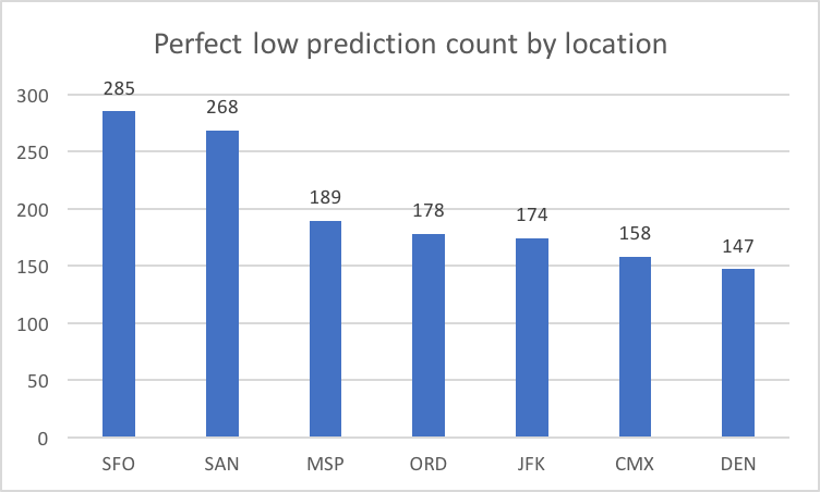
You're almost twice as likely to get a perfect low prediction in San Francisco compared to Denver.
Nailing today's highs #
The range between providers here is much smaller. Where Dark Sky was the best at predicting today's low, they are the worst of the bunch at predicting today's high.
Error Mean Absolute Deviation (MAD) #
AKA objectively speaking, how far off were the predictions from the actual measurements for the entire date range? The formula is Sum(Absolue Value of(prediction - actual)) / Number of Predictions. A zero value would be a perfect prediction every time. A lower value is more accurate.
Today's low temp MAD by provider #
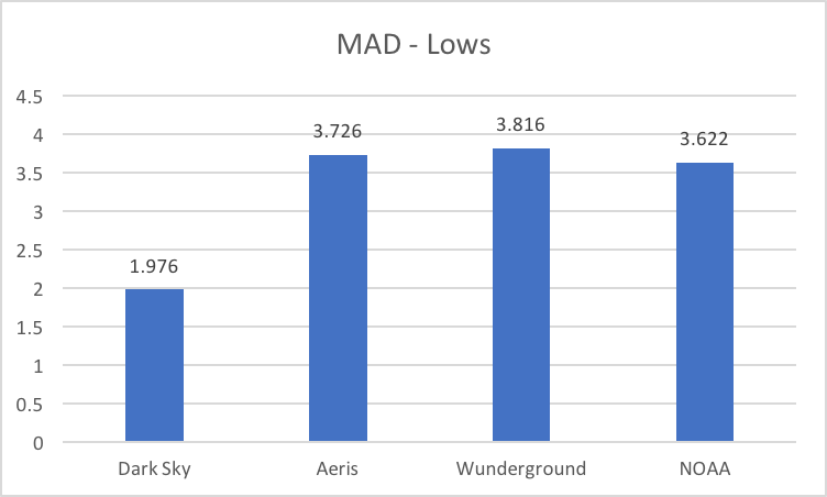
This chart correlates closely with the counts of getting the low temp exactly right, which implies Dark Sky is consistently better at predicting low temps,
with the other providers doing about the same as each other for that category.
Today's low temp MAD by location #
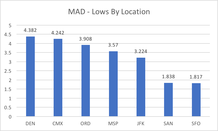
This chart shows Denver as being the most difficult location among the gang to predict for low temps, with San Diego and SFO the easiest.
Today's high temp MAD by provider #
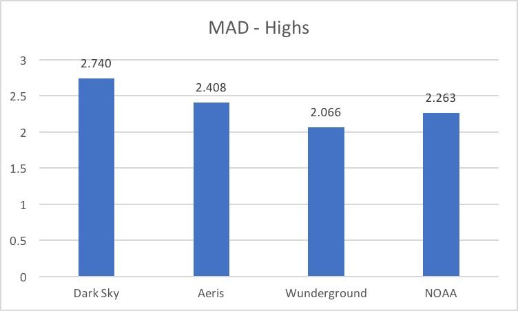
Wunderground on average is the most accurate at getting highs on average. What's mildly interesting is that NOAA and Wunderground tied
on their counts of exactly predicting today's high temp, so Wunderground having a lower MAD means they were on average closer to the actual high.
Measuring Precipitation Accuracy #
You can use the MAD calculation for temperature predictions to get an objective average score, but it's not as clear how to objectively measure for precipitation predictions, since they're probabilities and not absolute values. I think we can get close though. For example, if you say there's a 30% chance of rain, I say there's a 90% chance of rain, and it doesn't rain, you obviously did a better job of predicting rain than I did.
For cases where it didn't rain, the score for a prediction could be the probability value itself. e.g. Give you an error score of 0.3 for that prediction, and me a score of 0.9. A lower score indicates a more accurate prediction.
For cases where it did actually rain, the error score would be 1 - POP.
e.g. It rained, I predicted 30%, so my error score is 1 - 0.3, or 0.7.
Using this technique, here's a MAD-like score for today's precipitation prediction by provider for the time frame:
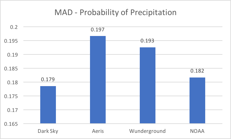 \
\
Measuring Temperature Accuracy By Tier #
How about some counts showing the subjective quality of each forecast? i.e. Let's say that exactly predicting today's temperature is considered perfect, within 1-3 degrees is good, 4-6 is ok, and > 6 is bad.
Quality count for today's low temps #
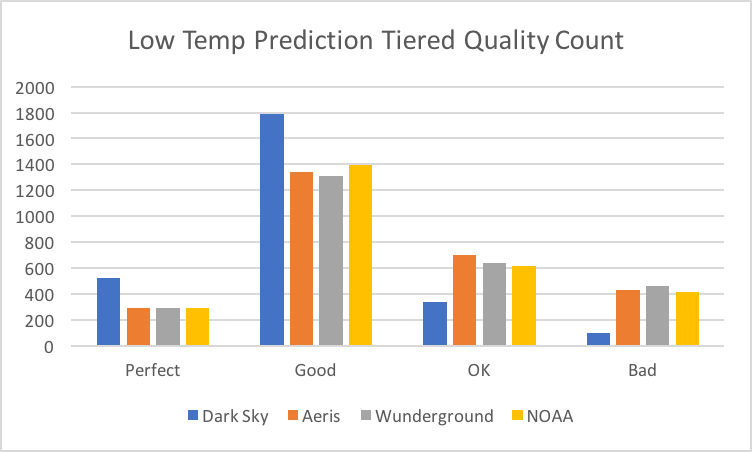
Once again, this chart shows that Dark Sky is considerably better than anyone else at predicting the low temp.
Quality count for today's high temps #
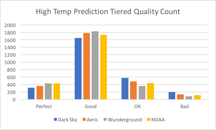
The accuracy comparison of the providers is much closer for measuring today's high temp.
Distance from NOAA #
My understanding is that NOAA is our government agency that does the heavy lifting for all the providers, and then they augment that information with their own analysis to further improve the quality of information. One question I had was, how much do the providers' forecasts differ from NOAA's?
Distance from NOAA for today's low #
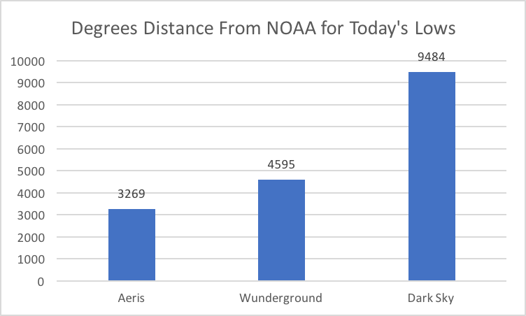
Dark Sky deviates from NOAA over twice as much as the next provider.
This was interesting, given how much better they were at predicting today's low temp compared to everyone else.
This made me wonder if there was a correlation between distance from NOAA and accuracy.
Distance from NOAA for today's high #
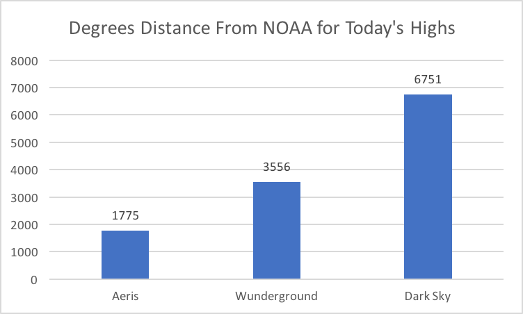
Again Dark Sky deviates from NOAA by far more than anyone, but their high temp accuracy was the least accurate.
So being different isn't necessarily better in this case.
Conclusion #
This turned out to be more charts that I originally intended, but it was interesting to me to view the data from different angles. Each provider presents the information in a little different way, with some more accurate in different areas than others.
I did make one change to my phone's weather apps. In the past, I only used Wunderground because it has the best user interface for how I want to see the information. Since analyzing this data, I've also added Dark Sky to my apps simply because they were so good at low temp predictions. Their UI is novel, but its hyper-local precipitation predictions actually haven't been more useful or accurate for me than glancing at the radar.
From a novice consumer's perspective on forecasting, I would make these changes:
- Analyze and adjust those 0% and 100% POP error situations. They shouldn't ever happen. Ever.
- License or emulate whatever special sauce Dark Sky puts in today's low temp predictions.
- Recognize current limits in long-range forecasting and lessen forecasting confidence for 3 or more days out to be between 20-80% or some other squishy number. No more zero and 100% chance of rain unless we're really really sure.
Did I make any mistakes? #
Please let me know if I did and I'll update the article. The code and data is referenced below, and social links are in the footer.
References #
- Forecast API Client Project
- Queries used to collect the data
- Data Collected
- NOAA Weather History Downloads
- Previous: Camp Lotto
- Next: Please Don't Teach C to Beginning Programmers